Posted on Leave a comment

Visualizing Architecture

Texas Prairie: Detail Elevation
I choose this design because I love how it brings into focus not just the elevation but also the design. It looks very beautiful with a bright background. I first zoomed in on the side of the canopy to have an elevation and rendered it in Rhino. I then imported that into Photoshop. I then separated the image into layers in order to isolate the background by clicking color range and isolating the white background. After the background was deleted, I imported a green sky picture that I made separately into the canopy picture. I moved that layer second so that it is sent to the back. I also adjusted the green sky image by changing the brightness and contrast to make it lighter. I adjusted the canopy image to make it a little dark so that it stands out against the sky.

Big Office on the Prairie


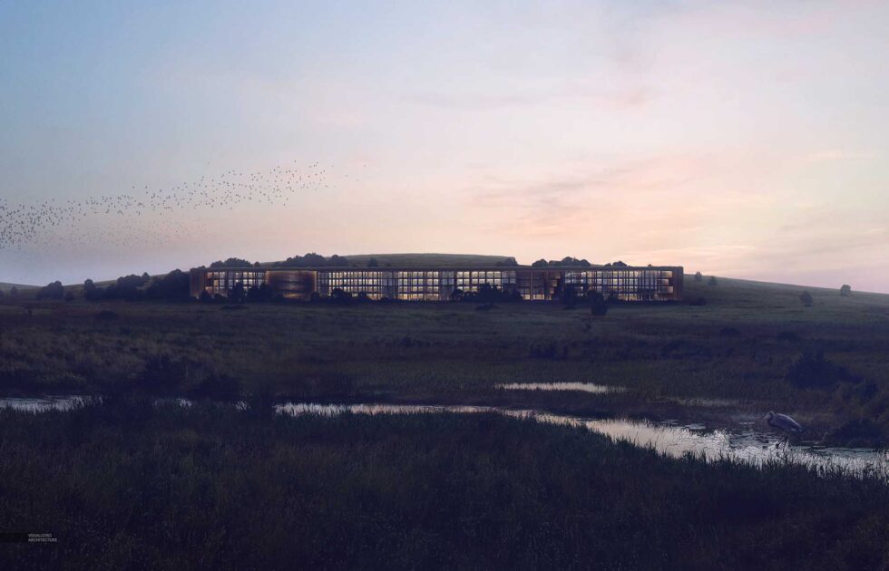
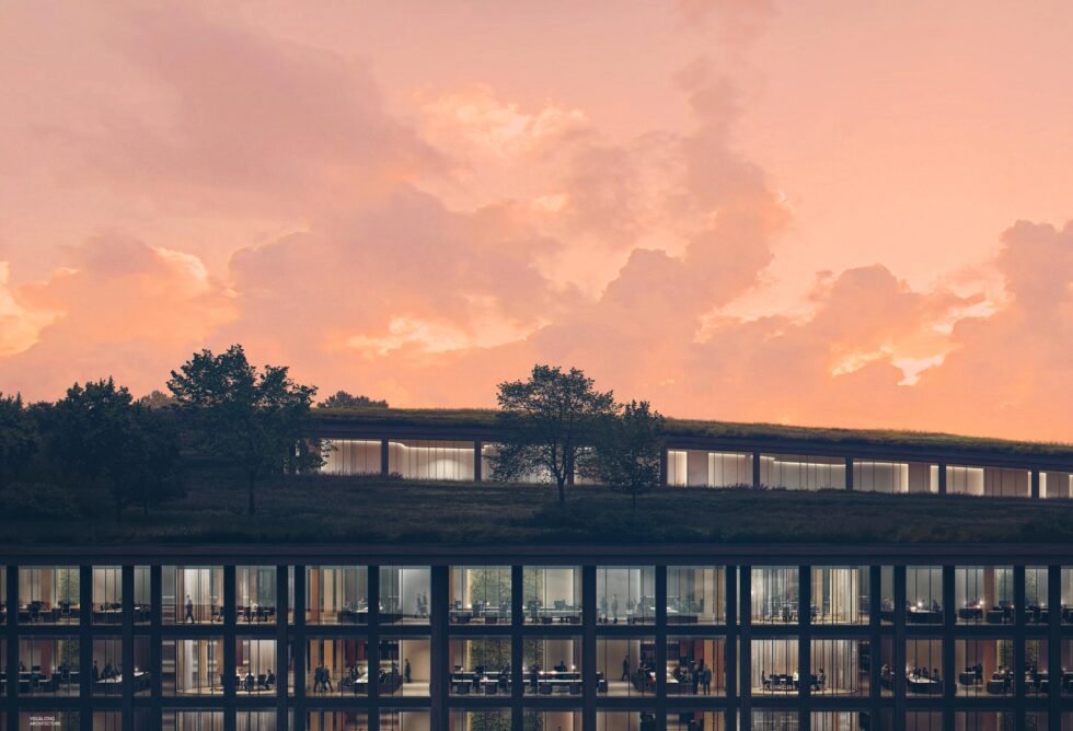
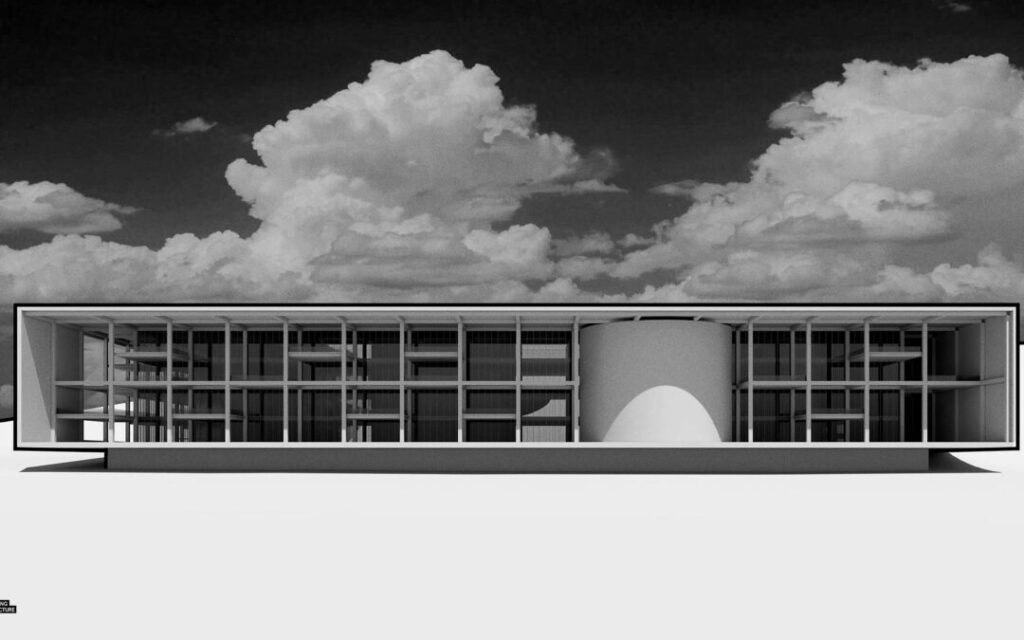
This is the Big Office on the Prairie and this design drew my eye immediately. I choose this style because I love the black and white approach. I feel that it looks very modern and sleek. It brings the design into focus more which is what I wanted to contribute to my project. In order to create this design, I first rendered an image in Rhino and imported it into Photoshop. I then went to the Image tab and went to Adjustments. Under Adjustments, there is a button called “Black & White” which I clicked. The image immediately became black and white. In order to match the green aesthetic, I once again went to the Image tab and under Adjustments, I clicked Photo Filter. A window popped up and clicked Color which I changed to green. This was able to make the whole image shades of green which I loved.

Porter Sq. Distance View

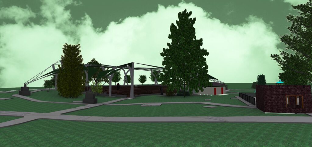
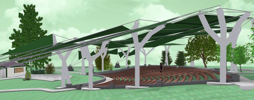
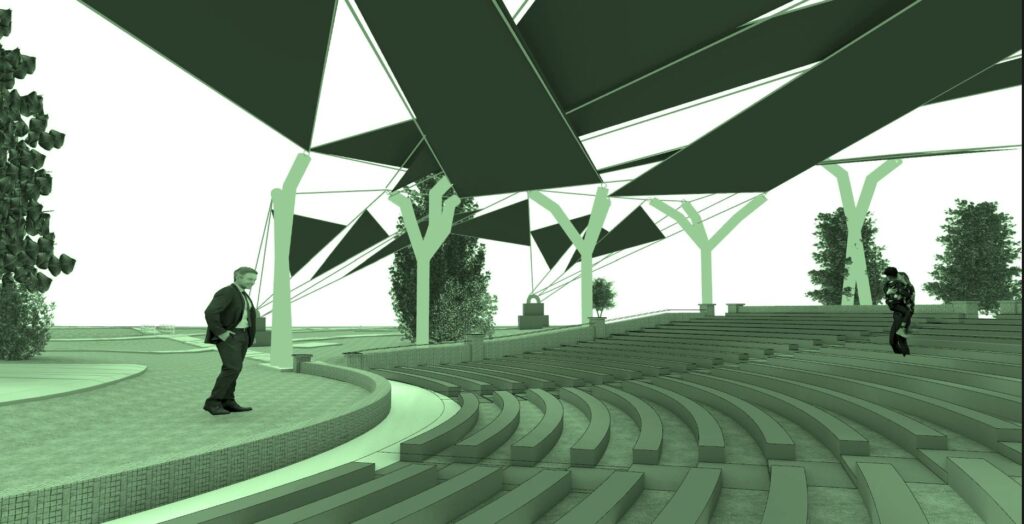
This is the Porter Sq. Distant View and this design is really beautiful. I choose this style because I feel that it gives a lot of character to the building. It makes the design look incredible so I choose this style for my project. I rendered a far view from the gazebo to the canopy in Rhino first. I wanted to be able to see the entire canopy. I then imported that into Photoshop in order to edit it. I went to the Select tab and went to Color Range. Then I isolated the white background and deleted it. I then added the green sky layer and moved it to the second layer for it to be behind the original image. I went to Brightness/ Contrast to adjust the image and brighten the sky more. The Porter Distant view inspired my edit to look at the canopy from a new angle.
Texas Prairie: Color Grading
This is of the Texas Prairie: Color Grading. I really liked this because I loved how the foreground of the structure was dimmed so that the sky stands out. I first rendered an image in Rhino from further away of the canopy to get the entire structure. I imported that into Photoshop and went under the Select tab and clicked Color Range. I clicked the white background to delete it so that it is transparent. I uploaded my green sky again to match my aesthetic of the project and put that as the second layer so it goes behind the image. I then clicked back on the image and went under the Image tab, hit Adjustments, and went to Brightness/Contrast. I adjusted it by lowering the brightness and increasing the contrast slightly to make it a little darker. It really made the sky stand out.

Leave a Reply

Your email address will not be published. Required fields are marked *