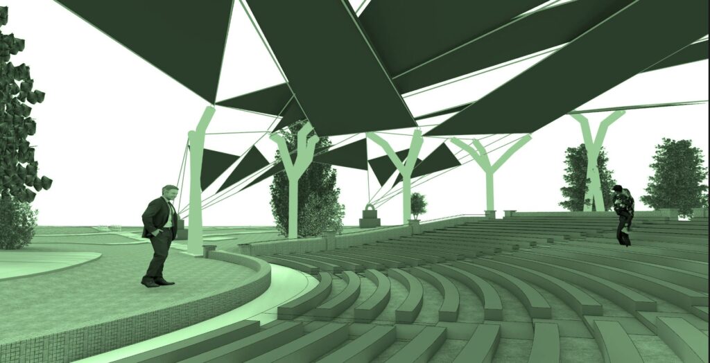
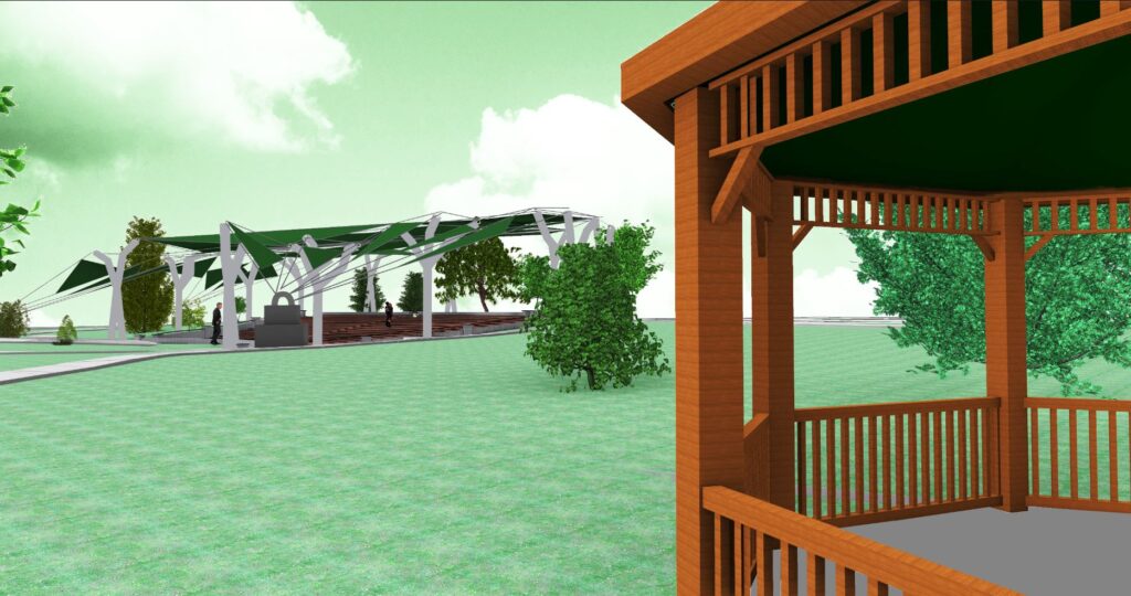
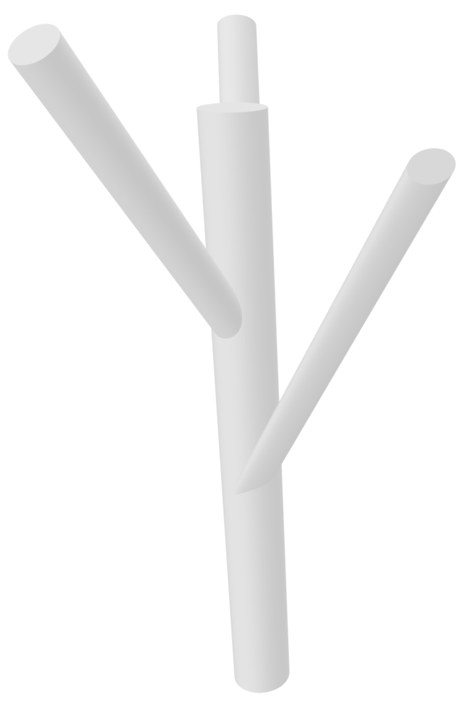
I choose this design because I love how it brings into focus not just the elevation but also the design. It looks very beautiful with a bright background. I first zoomed in on the side of the canopy to have an elevation and rendered it in Rhino. I then imported that into Photoshop. I then separated the image into layers in order to isolate the background by clicking color range and isolating the white background. After the background was deleted, I imported a green sky picture that I made separately into the canopy picture. I moved that layer second so that it is sent to the back. I also adjusted the green sky image by changing the brightness and contrast to make it lighter. I adjusted the canopy image to make it a little dark so that it stands out against the sky.
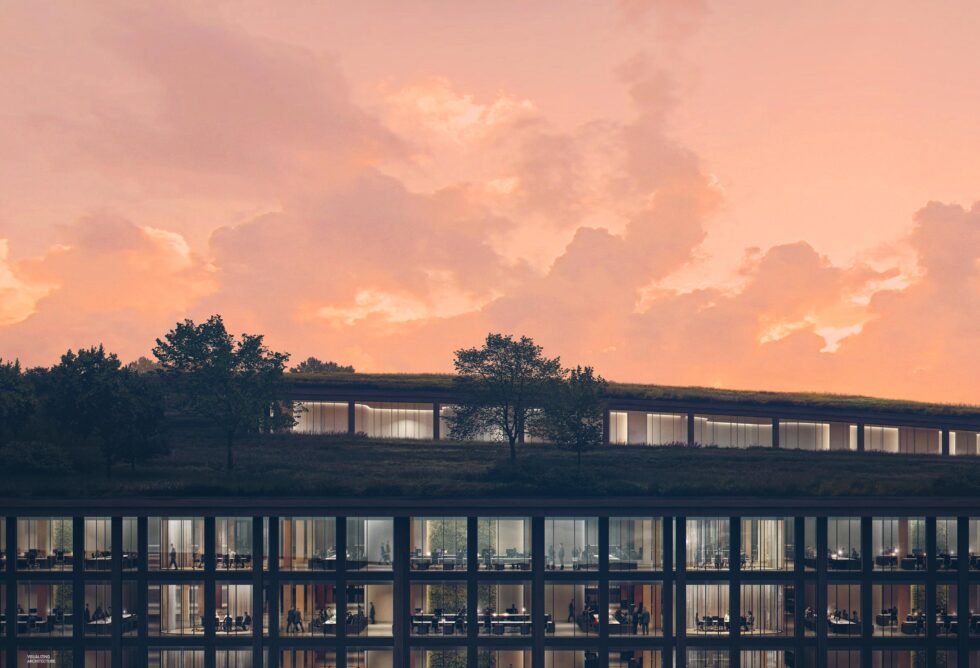
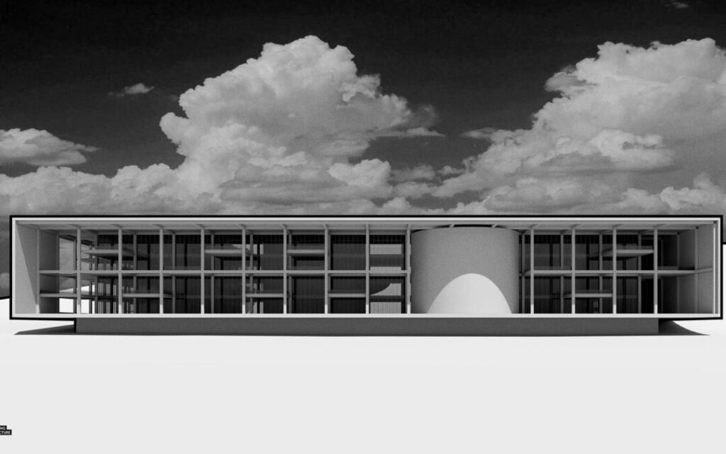
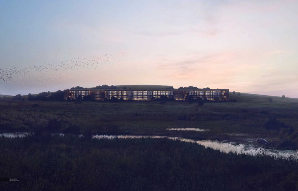
This is the Big Office on the Prairie and this design drew my eye immediately. I choose this style because I love the black and white approach. I feel that it looks very modern and sleek. It brings the design into focus more which is what I wanted to contribute to my project. In order to create this design, I first rendered an image in Rhino and imported it into Photoshop. I then went to the Image tab and went to Adjustments. Under Adjustments, there is a button called “Black & White” which I clicked. The image immediately became black and white. In order to match the green aesthetic, I once again went to the Image tab and under Adjustments, I clicked Photo Filter. A window popped up and clicked Color which I changed to green. This was able to make the whole image shades of green which I loved.
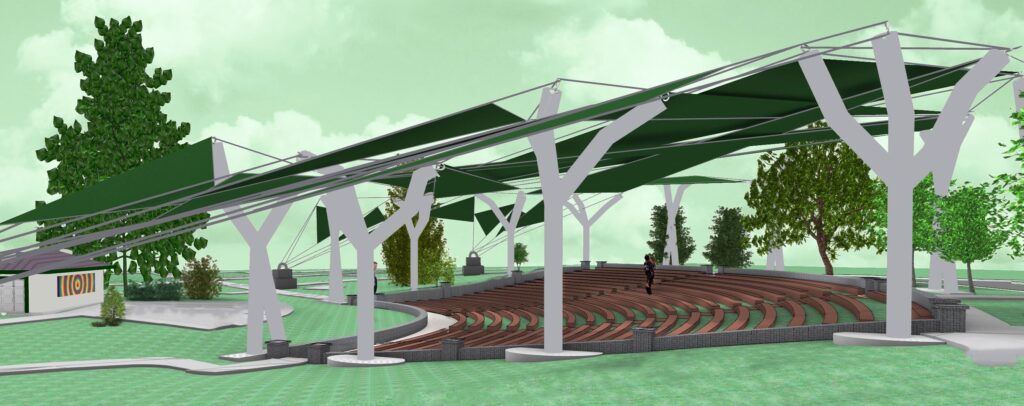
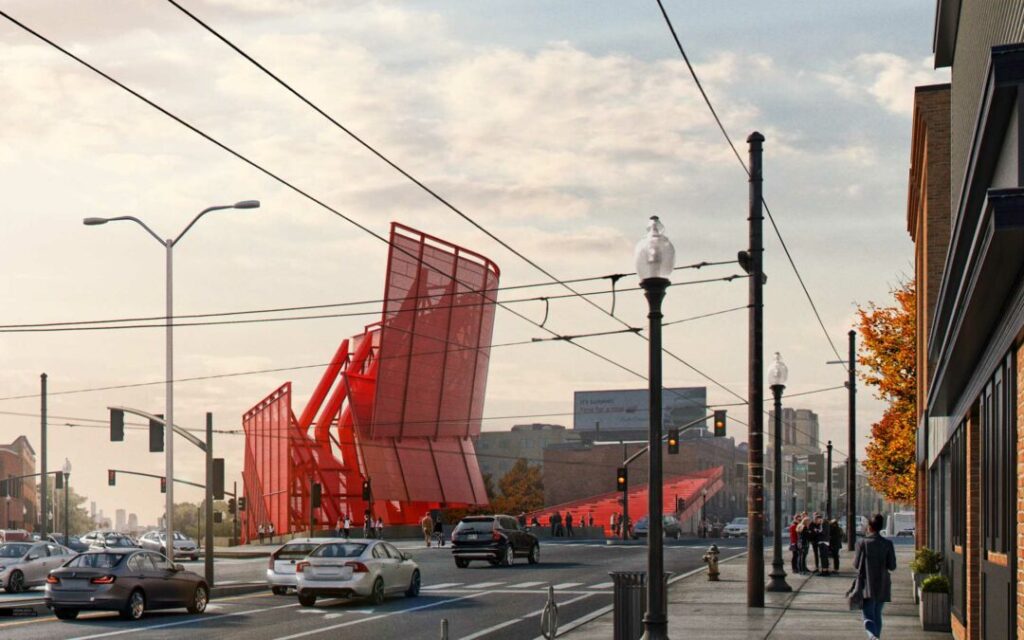
This is the Porter Sq. Distant View and this design is really beautiful. I choose this style because I feel that it gives a lot of character to the building. It makes the design look incredible so I choose this style for my project. I rendered a far view from the gazebo to the canopy in Rhino first. I wanted to be able to see the entire canopy. I then imported that into Photoshop in order to edit it. I went to the Select tab and went to Color Range. Then I isolated the white background and deleted it. I then added the green sky layer and moved it to the second layer for it to be behind the original image. I went to Brightness/ Contrast to adjust the image and brighten the sky more. The Porter Distant view inspired my edit to look at the canopy from a new angle.
This is of the Texas Prairie: Color Grading. I really liked this because I loved how the foreground of the structure was dimmed so that the sky stands out. I first rendered an image in Rhino from further away of the canopy to get the entire structure. I imported that into Photoshop and went under the Select tab and clicked Color Range. I clicked the white background to delete it so that it is transparent. I uploaded my green sky again to match my aesthetic of the project and put that as the second layer so it goes behind the image. I then clicked back on the image and went under the Image tab, hit Adjustments, and went to Brightness/Contrast. I adjusted it by lowering the brightness and increasing the contrast slightly to make it a little darker. It really made the sky stand out.
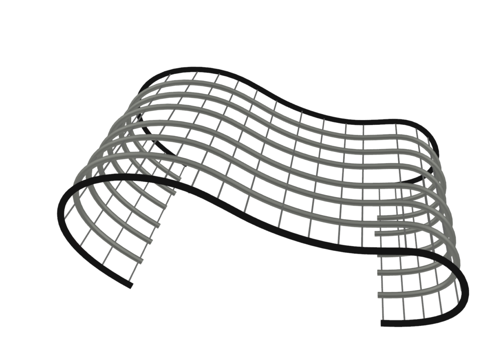
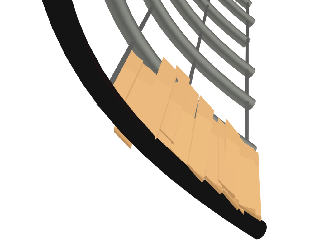
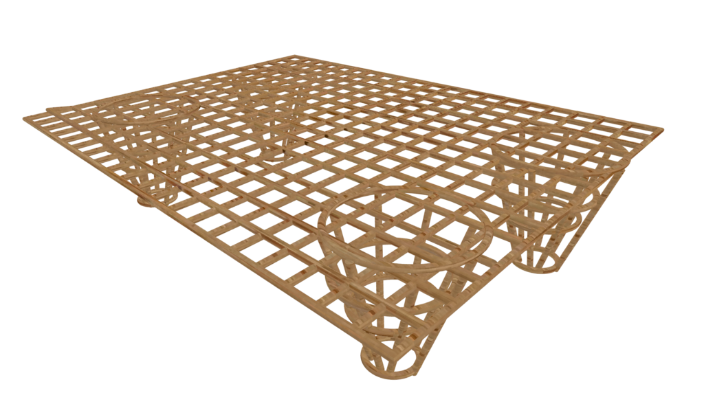
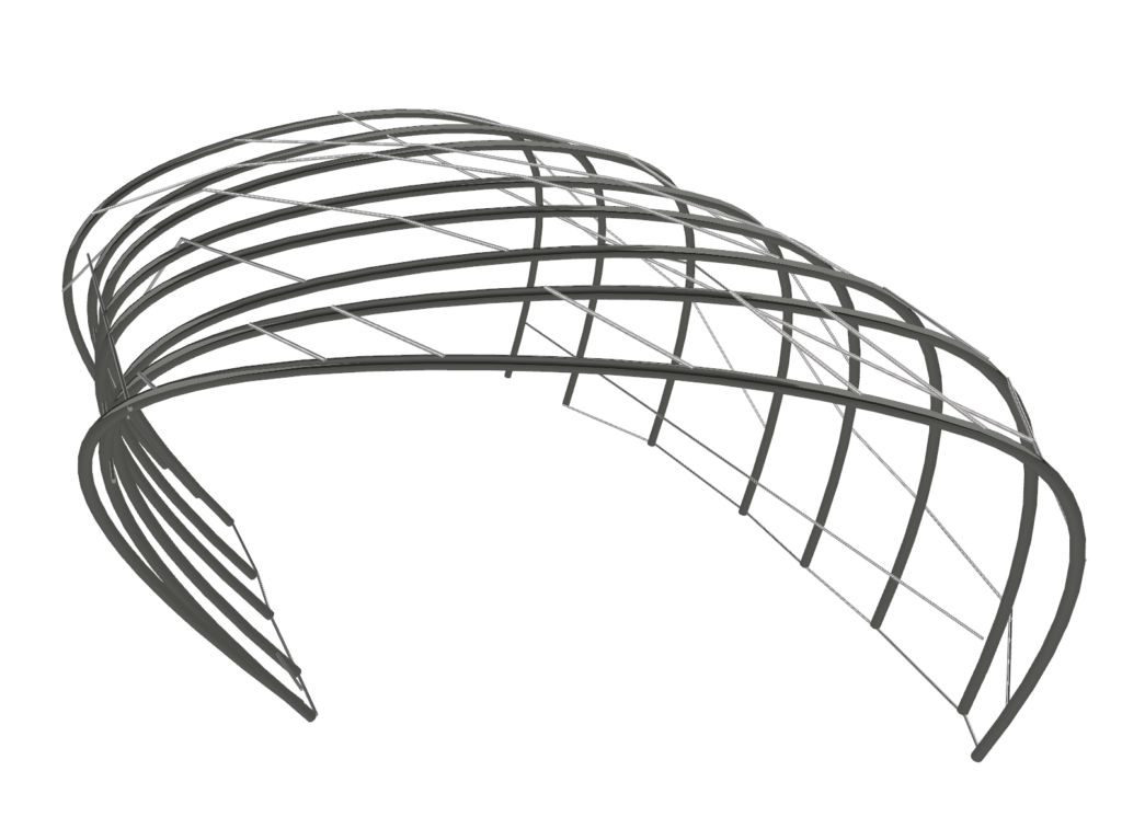
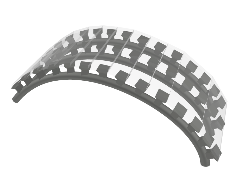
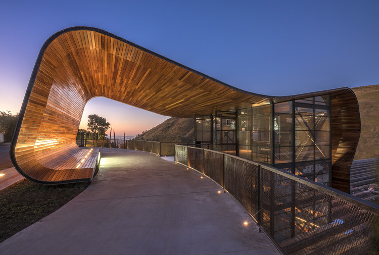
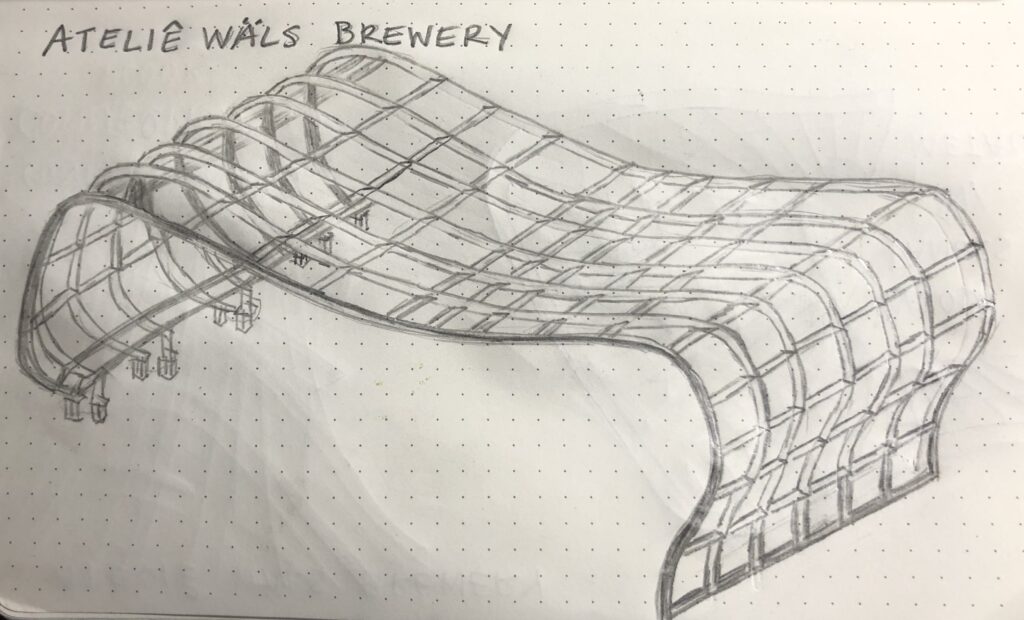
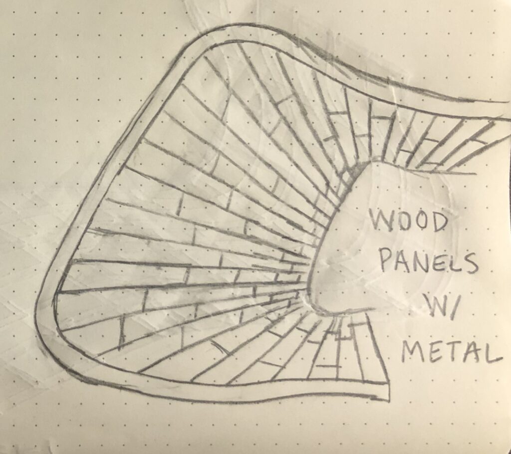
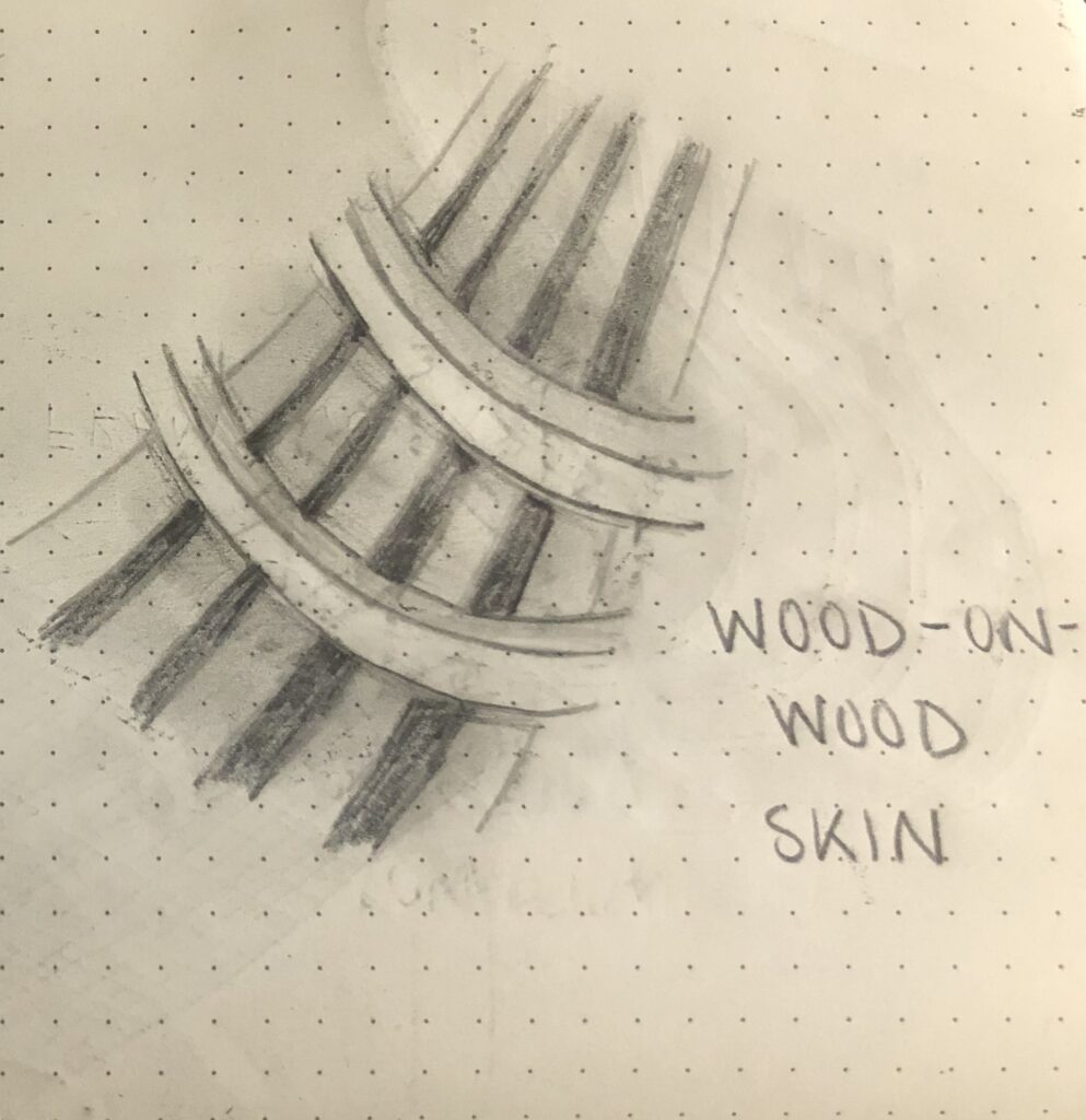
This wave-shaped canopy was designed by Gustavo Penna Arquiteto & Associados (GPA&A) for Ateliê Wäls’ Brewery company located in Brazil. It is made of wood panels and shaped as if it was a ribbon surrounding the building. It is a porte cochère which means it is a drive through entryway towards the brewery. This beautiful structure is 17 feet above street level. It forms a tunnel that is about 38.5 feet deep. It is stated that if the curved wooden canopy were unrolled and flat on the ground, it would measure to be 104 feet long. GPA&A partnered with a structural engineering firm called Misa Engenharia de Estruturas to design the canopy’s steel frame. This company was able to make the steel structure thin so that the main focus is on the wood panels. This precedent will help explore the movement isn’t restricted to certain materials.
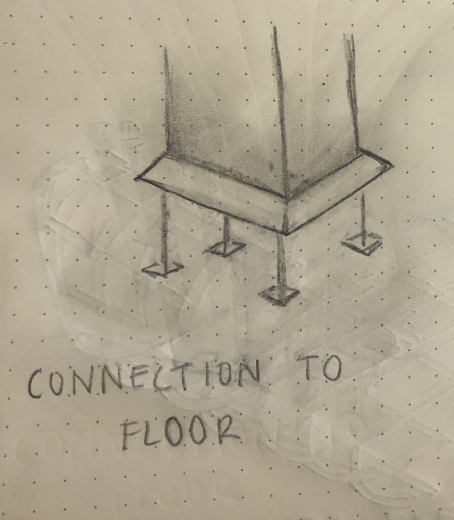
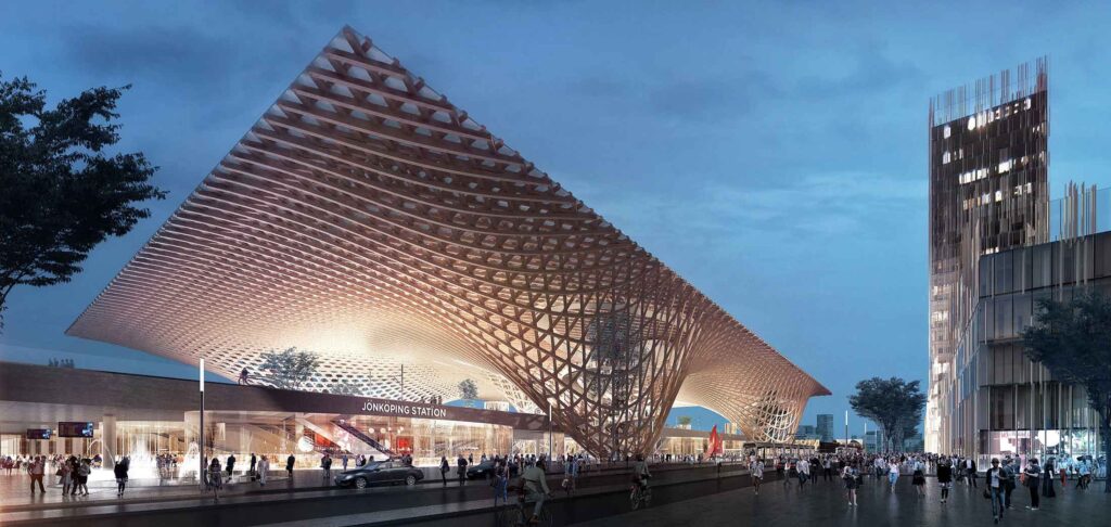
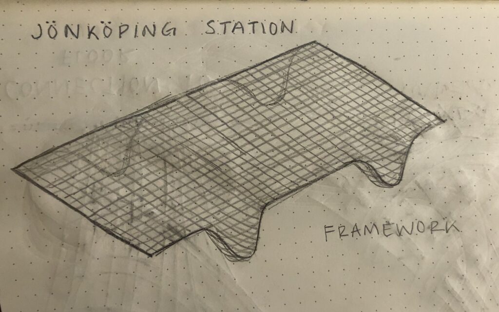
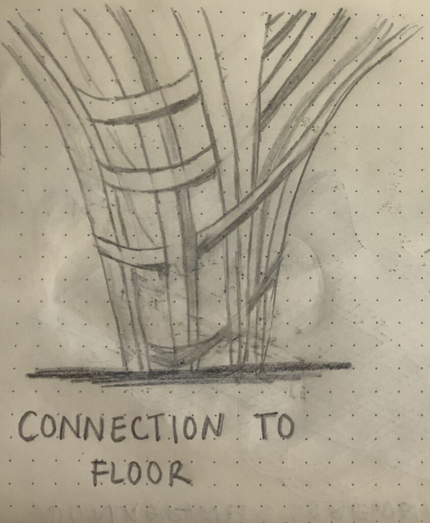
Jönköping Station
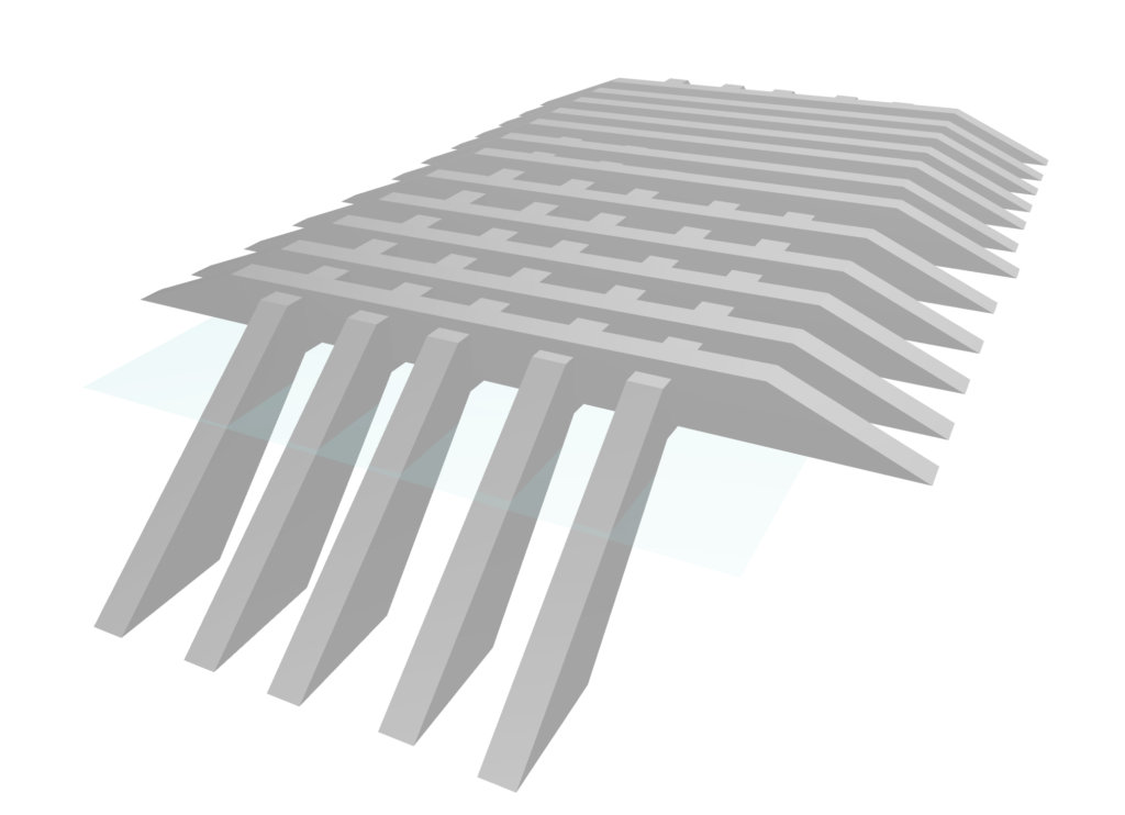
Erik Giudice Architecture designed this environmental wooden canopy in Jönköping, Sweden. It was created for Jönköping Municipality in 2016. They used organic wood in large beams to create the curves throughout the canopy. It is transparent so that light can cast beautiful shadows on the ground and is illuminated at night. The surface is measured to be about 10,000 m^2. It covers over a car and bike service, and a train station. This design helps explore the concept of green architecture due to them using environmentally friendly materials. It also inspires me to see how to create light patterns during the day and how it is important to include some form of lighting at night to emphasize the design.
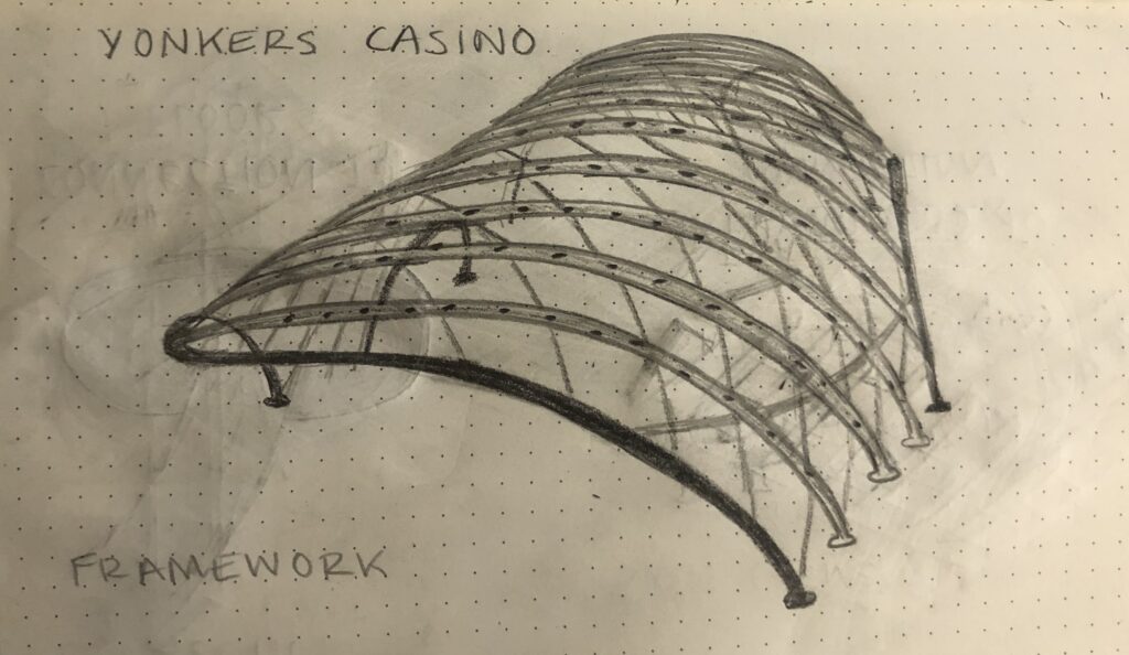
Yonkers Casino
Studio V Architecture and Tillotson Design Associates (TDA) designed this canopy for the Yonkers Casino in New York. It is measured to be a 300 ft arch canopy and is 66,000 sq ft. The canopy is about 200 ft long. It is a glass facade that is outlined in an intricate metal framework. Along the framework are lights that illuminate canopy in multiple colors creating beautiful patterns. The designers had to use ETFE-illuminating stem-mounted LEDs, that sit 12 inches above the frame. They wanted to capture the essence of gaming on the outside of the casino. This precedent will help me look into inspiration from within the site like how the designers wanted to bring the casino to the outside. I also want to look into lighting techniques to make the canopy a focal point at night.
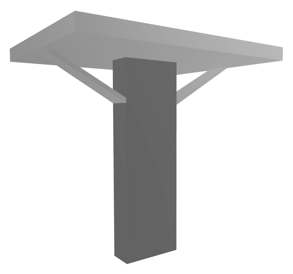
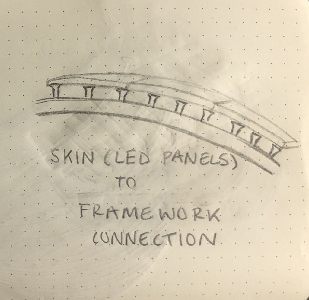
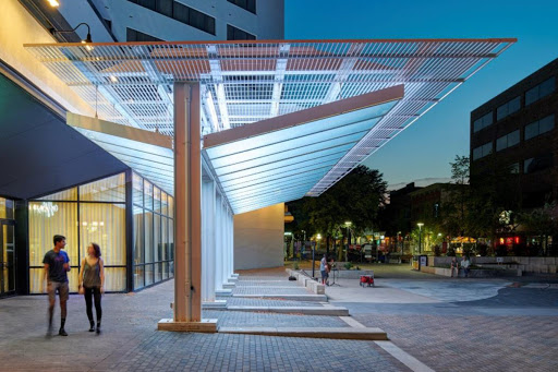
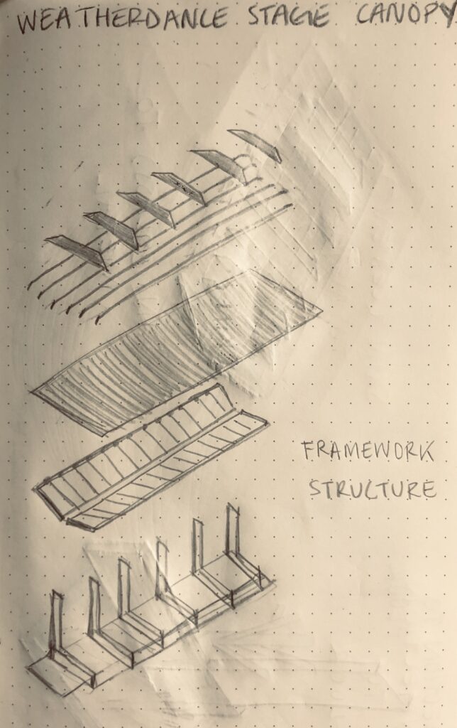
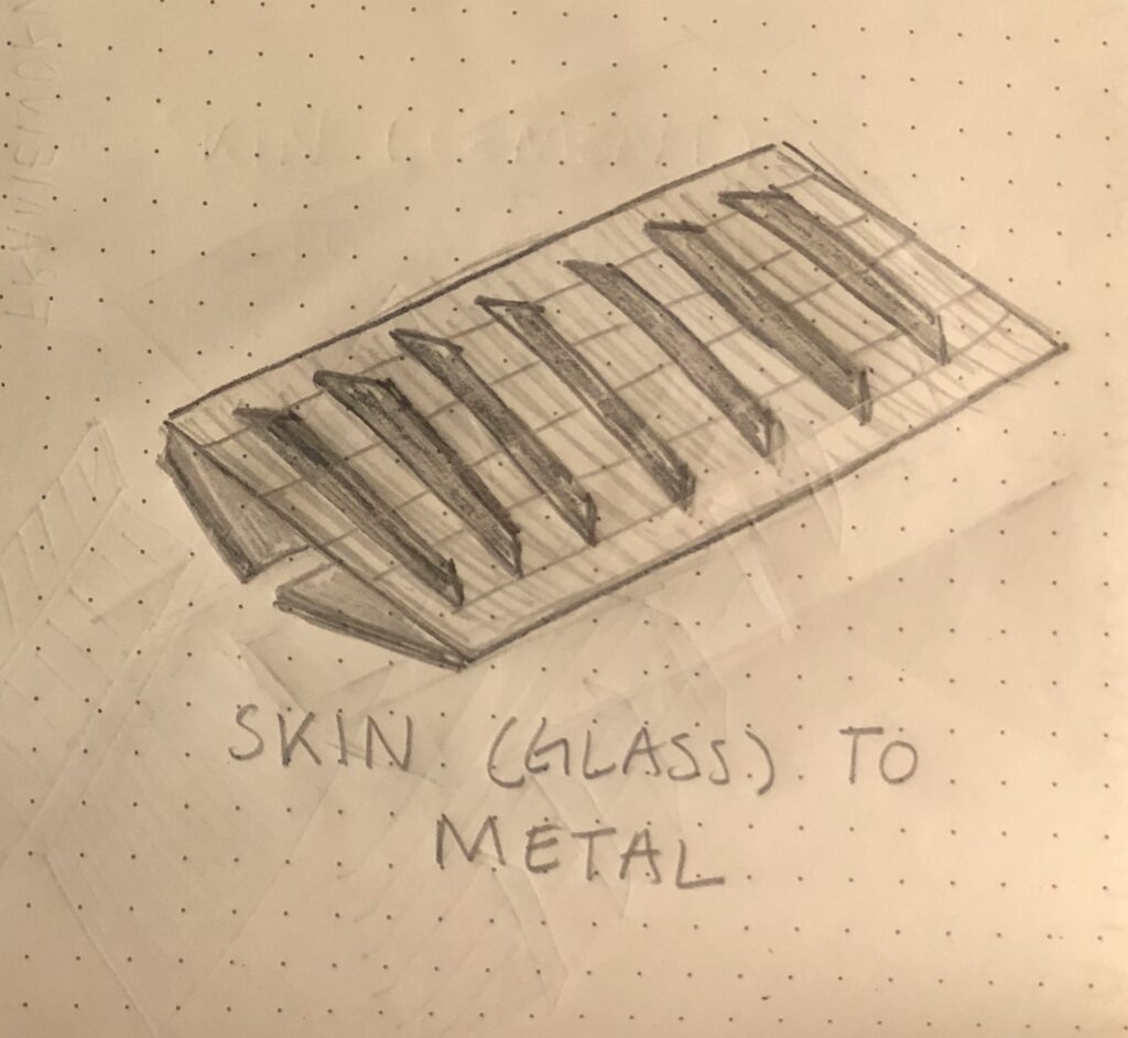
Weatherdance Stage Canopy
The Weatherdance Stage Canopy is located in Iowa City, Iowa. It was designed by Neumann Monson Architects along with Genus Landscape Architects. It is approximately 1,700 sq ft. During the day, it is a modern meet-up point or where street artists can perform. It has six wide steel columns through the canopy to support a cantilever. The canopy includes sloped glass planes that maximize acoustics. At night, the canopy transforms because of the glow of its color-changing LEDs that is programmable. This precedent explores the grid pattern that is used throughout the canopy. It helps in understanding how simplicity is important in giving an elegant design. Their design utilizes one color which elevates the canopy. This can help me to focus on the structure of my design over the color.
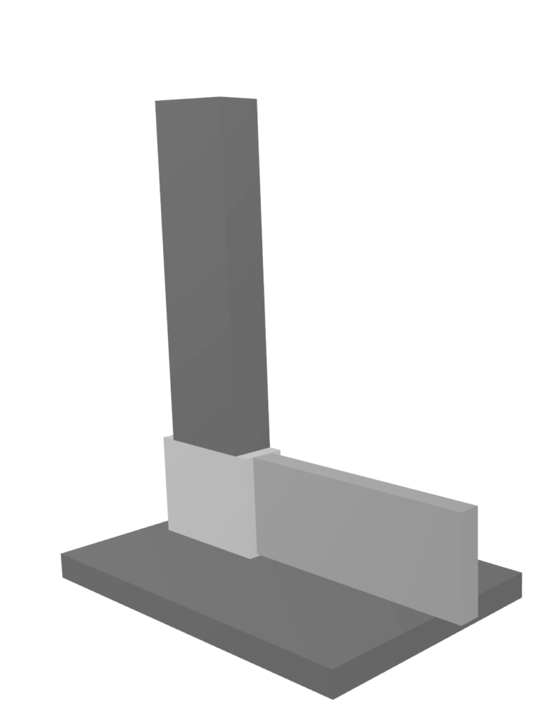
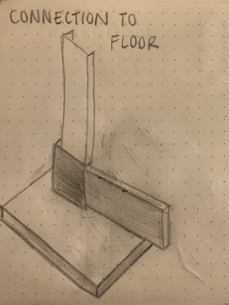
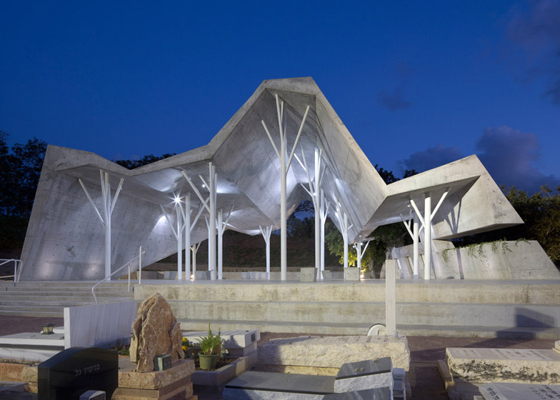
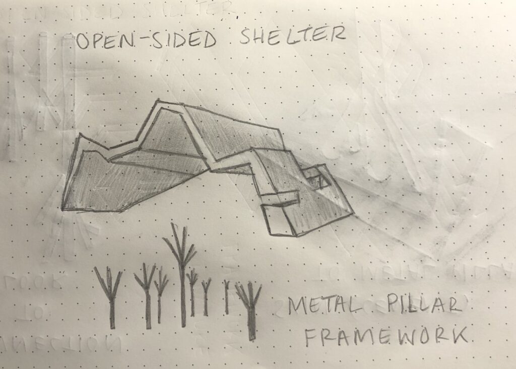
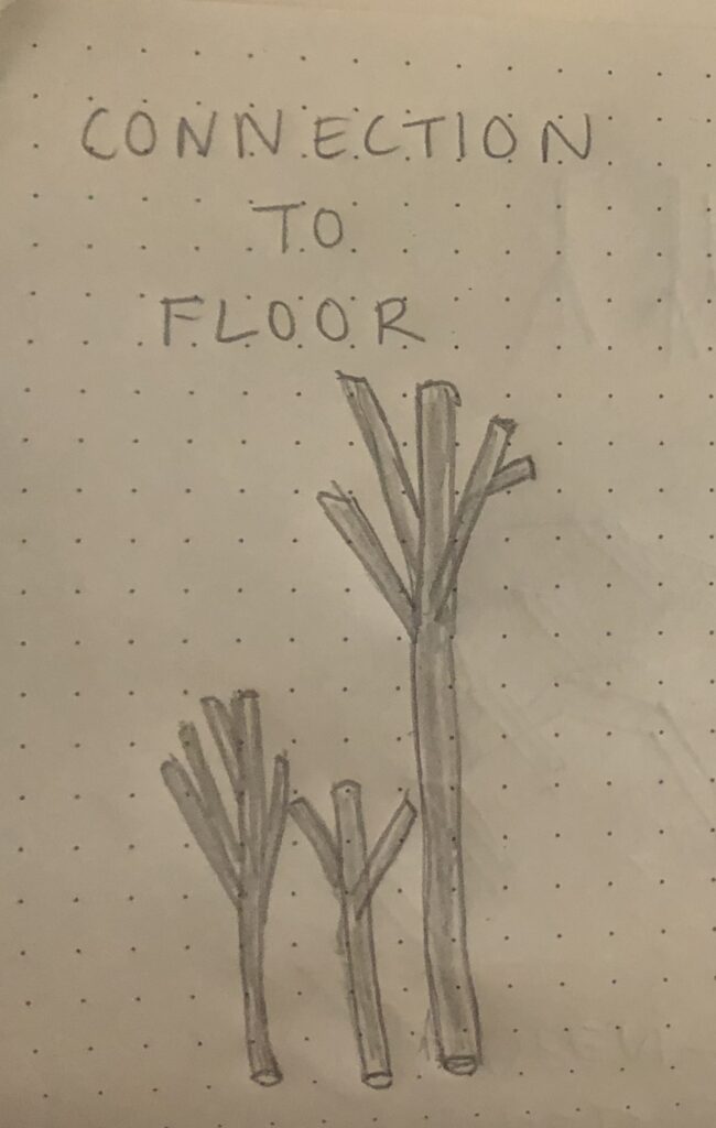
Open-Sided Shelter
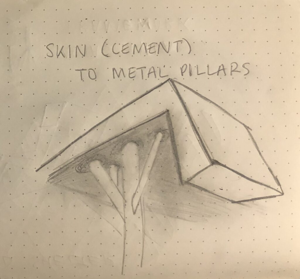
Ron Shenkin Studio for Design and Architecture designed this open-sided shelter that is located in Pardesiya, Israel. It was completed in 2015 and is 3465 sq ft. The canopy was designed as a place for people to give eulogies and to be with themselves. It has two entrances where one side is facing the cemetary. The pillars are metal and the roof is sheets of cement. It appears to look like one single piece of stone that is bent to give the canopy a geometric look. During the evening, the building’s interior and exterior are illuminated. The canopy is monochromatic with shades of gray. This helps bring some feeling of lightness to the grim atmosphere of the cemetery. This precedent will help explore using a simple color palette to emphasize the design. It can also show how to utilize multiple access points by having both the front and back open.
“Sensory experiences become integrated through the body or rather, in the very constitution of the body and the human mode of being.” pg 40
St. Louis Cathedral was so majestic. Stepping inside, you felt transported to another world. I had goosebumps when I looked up at the high ceiling to see the intricate paintings and the delicate gold borders around them. The smell of wax from the many candles being lit at the altar engulf you. You felt a sense of warmth being surrounded by all the religious artwork. You also felt a wave of peace washing over you. The large altar at the front drew your eye immediately and then made you walk towards it.
“…there is no body separate from the its domicile in space, and there is no space unrelated to the unconscious image of the perceiving self” pg 40
Outside of the Louvre, it felt as if you were in two different worlds; one being futuristic and the other being transported back into the time of the Renaissance. The courtyard is very spaced out and made you feel so small compared to the large structures. You can hear the water fountains from the pond which essentially hushed the crowd resting outside. You are also surrounded by the sounds of many different languages because of the many tourists that come to visit this prestigious attraction.
Multi-Sensory Experience
“[Architecture] is not an isolated and self-sufficient artifact; it directs our attention and existential experience to wider horizons.” pg 41
In Lucien, the architecture guided you to see the beautiful mountains and the lake across from it. The soft breeze coming off the lake provides a calming presence as you walk through the streets. The buildings felt as if they were wrapped around you and gave you a sense of comfort. It helped guide your eyes to the environment surrounding us. The noise of the crowds were a small murmur that was hidden by the large structures.
“Even the eye touches; the gaze implies an unconscious touch, bodily mimesis and identification.” pg 42
When your eyes first see the Louvre Pyramid, you can feel the coldness of the glass that it is made of. You can smell the metal of the bars that outline the pyramid. It seems almost godlike, contrasting the older architecture of the museum surrounding it. Your eyes are immediately drawn to it and your body is frozen in time just observing it.
“Good architecture offers shapes and surfaces moulded for the pleasurable touch of the eye.” pg 44
The detailed golden borders that surround the large painting on the ceiling make you feel like royalty. Your hands can feel the rough and smooth textures of the intricate carvings that outline the ceiling. You can feel the coldness of the borders between your fingers. You can smell the metal of the stone that was used to create the small statues.
“The senses not only mediate information for the judgment of the intellect; they are also a means of igniting the imagination and of articulating sensory thought.” pg 45
The Grand Place is so full of life and amazement. The towering structures cast beautiful shadows along the plaza. The gold accents on each of the buildings brings the whole complex together. Your mind is taken to a different time period as your eyes are lost in the buildings. You can hear the buzzing of many people filling up the plaza. You can almost feel the carvings that are at the top of the buildings.
Architecture creates structures that last for long periods of time. It has to adapt with the people and its surroundings. It takes everything in before being created to emulate the same ideas and values as its surroundings did before. Architecture doesn’t want to disrupt the atmosphere but rather take it all in and be a part of it.
“I do not think of [architecture] primarily as either a message or a symbol, but as an envelope and background for life which goes on in and around it…” pg 12
“Details express what the basic idea of the design requires at the relevant point in the object: belonging or separation, tension or lightness, friction, solidity, fragility…” pg 15
Details help bring the design together. No matter how small or unimportant it may be to others, it can transform the inside, outside or both. A certain detail can make you think of anything in a new way. It can help you appreciate your surroundings by paying attention to this minuscule thing.
The building should feel like it’s a part of you. You should feel a deep connection with the bare bones of the building. The vibrations should make you feel at one with your home. The inner tension and vibrations of the building makes the building feel alive which makes it become animate.
“I think that the hidden structures and construction of a house should be organized in such a way that they endow the body of the building with a quality of inner tension and vibration” pg 19
“…when we, as architects, are concerned with space, we are concerned with but a tiny part of the infinity that surrounds the earth, and yet each and every building marks a unique place in that infinity.” pg 22
Space is so vast that it can engulf us. Yet, each building is like a small detail added to that infinity. It makes space have ups and downs or different angles. Each building is exploring that space around it and becoming a part of it. Buildings are giving space more definition while also complimenting it.
The Magic of the Real
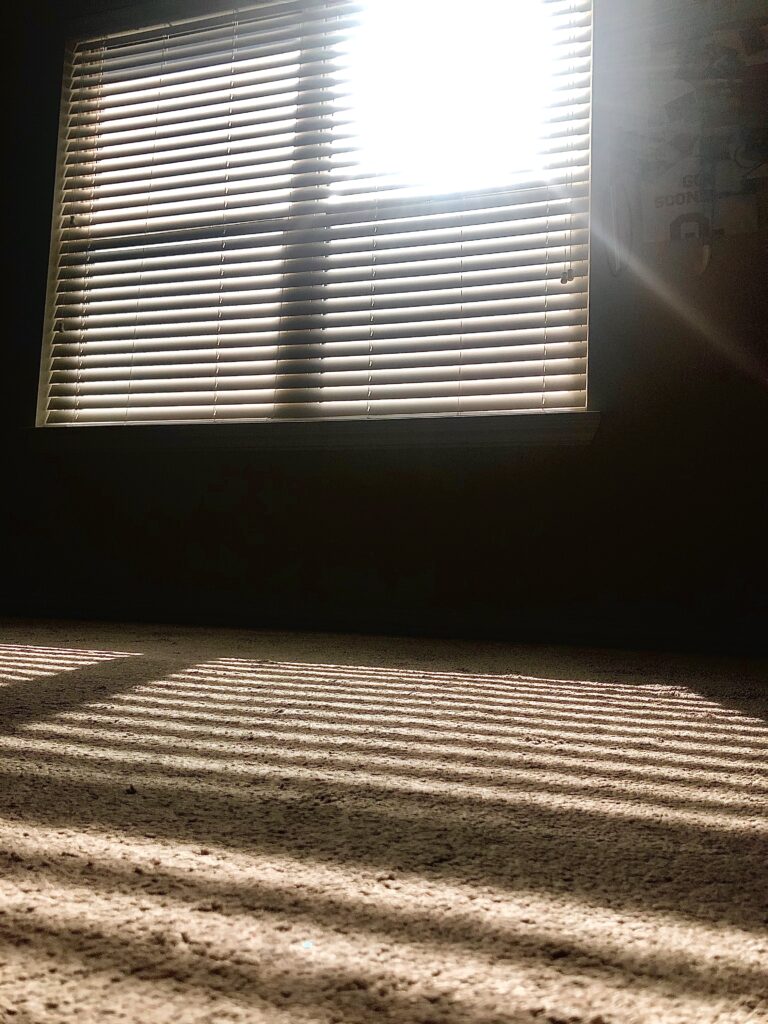
“There is the magic of the real, of the physical, or substance, of the things around me that I see and touch” pg 83
The shadows or light creeping the window blinds give a sense of magic to the place. The building doesn’t have to be filled with walls but can manipulate lights and shadows which can completely transform the space. The magic of the real gives architects more motivation to think outside the box. Abstract thoughts and ideas gives magic more substance which creates a unique structure.
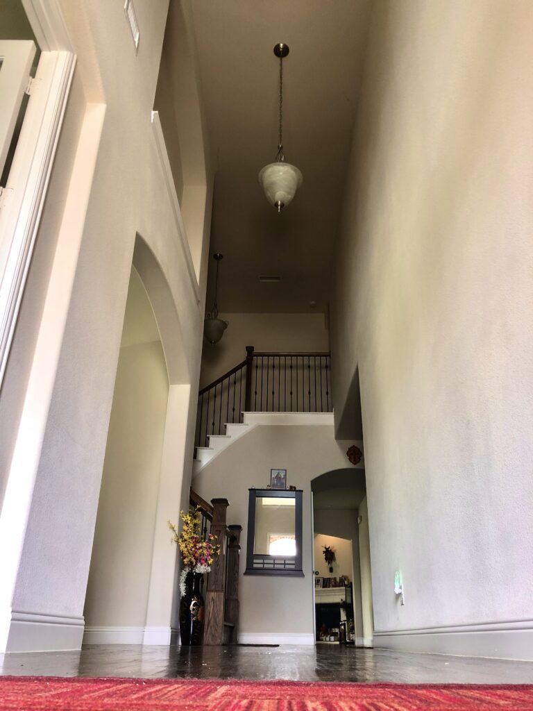
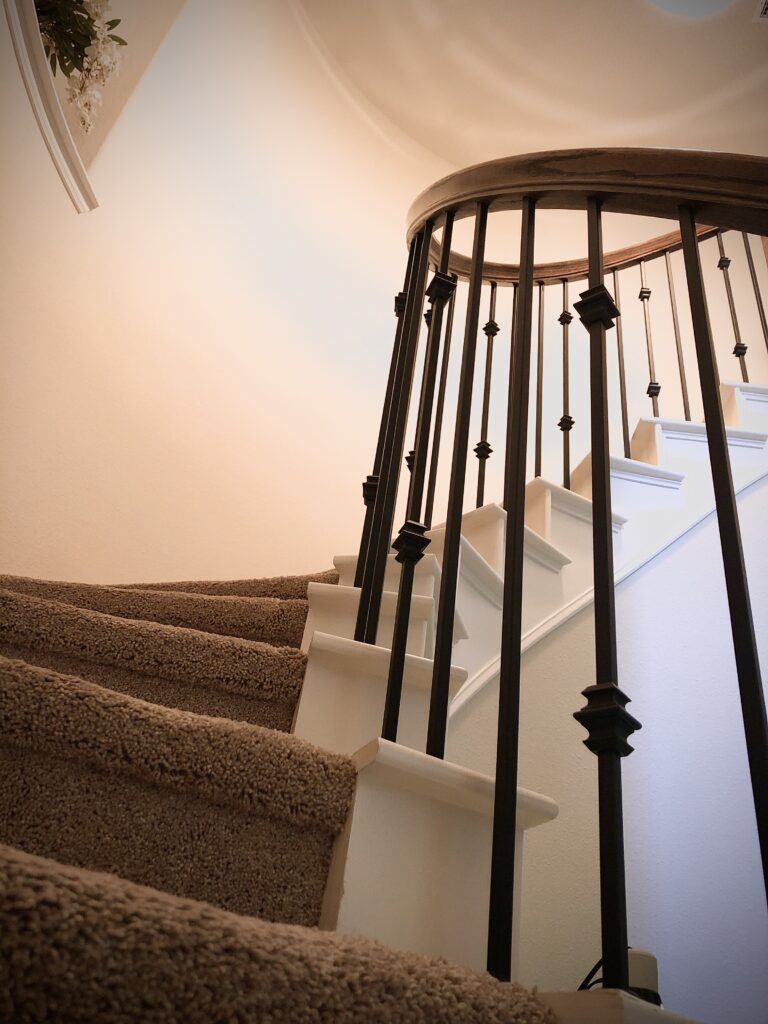
Architecture takes us on journeys we’ve never been on before. The way stairs are shaped or the arrangement of hallways can give a new sense of excitement to the building. A building can make us experience new emotions and create new memories. The arrangement of the interior is important in making the building have more life.
“I like the idea of arranging the inner structures of my buildings in sequences of rooms that guide us, take us places, but also let us go” pg 86
“Generating deep solids and gradations of shading and darkness for the magic of light” pg 87
Shadows and darkness is an amazing detail that gives more character to the structure. It can enhance certain details and transform the size and shape of the building. The magic of light creates beautiful patterns seen on the walls and floors. Light shows the building in a new way that creates a new experience going through it.